Visualizing a P&L for $5M client using Python, BigQuery, and Looker Studio
- info581233
- May 20, 2024
- 2 min read
Updated: Aug 6, 2025
A local business with $5M of annual sales needed help understanding their Quickbooks Profit&Loss report and what was affecting their profitability month over month.
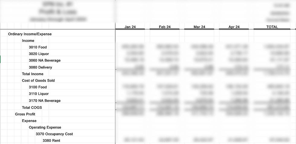
The problem was that they were working with a Quickbooks report that looks something like this:
First, I needed to use some Data Wrangling skills to transform this data into a flat report. Using the melt function of the Pandas library to create a flat data table with the following columns: Month, Accounting Line Item, and Dollar Amount. I did this with the following code:
import pandas as pd df = pd.read_csv('quickbooksfile.csv')
melted_df = df.melt(id_vars='Month', var_name='Accounting Line Item', value_name='Dollar Amount') melted_df.to_csv('reshaped_data.csv', index=False)This script sets 'Month' as the first column and the identifier, with another column for Accounting Line Items (Income, Expenses, etc) as a variable column, and a 'Dollar Amount' column as a value column. This leaves me with a table that looks like this:

Looking a lot better! But, a key part of understanding data trends is adding context to numbers. Instead of looking at nominal numbers (we spent X more on food in March vs Feb), I wanted to show the client proportional trends (we spent a higher proportion of our revenue on food costs in March vs Feb). To visualize this, I needed to create a helper data column with the following code, again utilizing the Pandas Python library:
import pandas as pd

df = pd.read_csv('reshaped_data.csv')

total_income_dict = df[df['Accounting Line Item'] == 'Total Income'].set_index('Month')['Dollar Amount'].to_dict()

df['Total Monthly Income'] = df['Month'].map(total_income_dict)

df.to_csv('updated_data.csv', index=False)
This script creates a Dictionary of the Total Income for the corresponding month by filtering the data to only include rows where the 'Accounting Line Item' is 'Total Income'. The 'Month' column is then set as the index and the 'Dollar Amount' column is then brought in, and the whole thing is converted to a dictionary.
The map function is then used to populate a new column called 'Total Monthly Income', using the 'Month' column as a reference the pull the corresponding Total Income from the dictionary that was previously created. This is very similar to using a LOOKUP function in Excel. Now I am left with a table that looks like this:

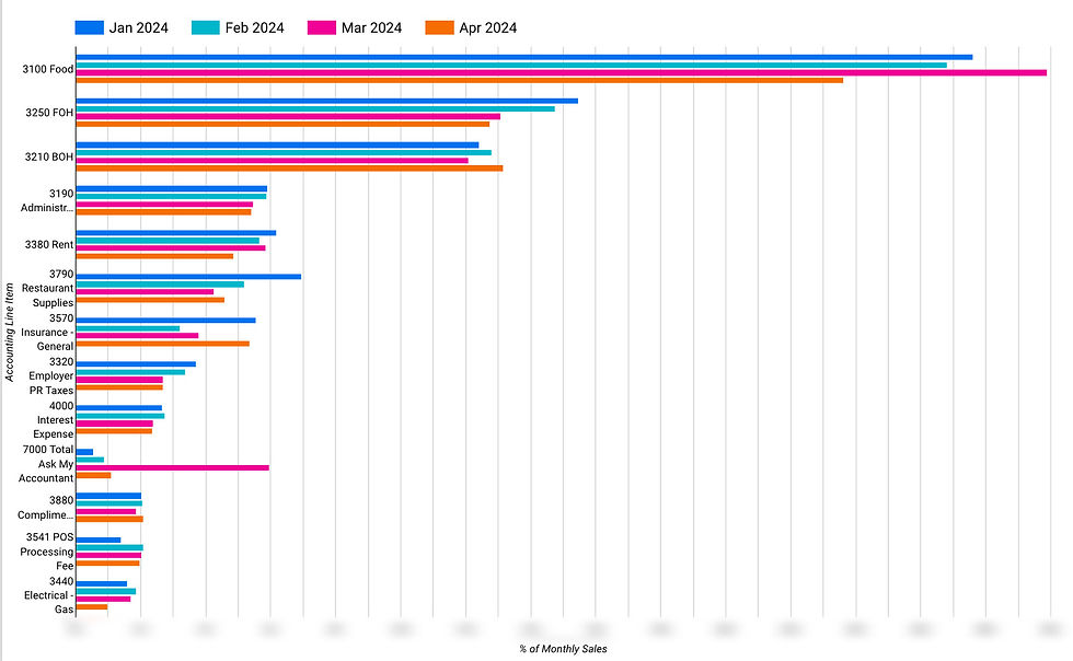
Looking perfectly useful! This table is then brought into Google BigQuery and connected to Looker Studio. Within a few clicks, we can clearly see how expense categories changed (as a % of monthly sales) throughout the months. This allows us to easily identify which categories require a closer look, and helps us compare apples to apples.
And there we have it! A little data wrangling, a little data visualization, and now we have a much better understanding of how to turn data into real business initiatives.


Comments